Climate change doesn’t seem to be top of the Australian government’s agenda, but students think differently. For #climatestrike day, we’ve put together a few of the most compelling visualisations that are helping make the extent of climate change visible.
Show your stripes
It’s rare that a graph becomes a cultural icon. But sometimes a piece pulls together the emotional impact and artistic coherence needed to make an instantly recognisable image.
An example is climate scientist Ed Hawkins’ Climate Stripes above, which visualise the average global temperature every year since 1850.
The stripes have been used as concert backdrops, on posters and tshirts all over the world. Hawkins wrote an article about it on Wednesday in The Conversation, where you can see trams and Teslas all adorned with the graphic wake-up call.
There’s something about these stripes. There’s no meaning at all to their height, but that’s the visual element that makes them a fashion icon. Other than that, there’s nothing that could be called chartjunk in there. No borders, no obtrusive chart lines, just pure graphic impact.
Magazine covers
The Economist will use the stripes on the cover of their September 21 issue, but that’s not the only piece of climate change data vis that’s adorned covers.
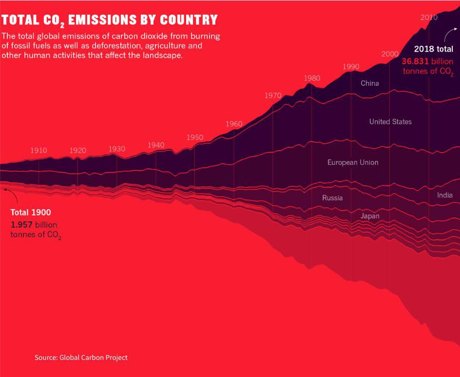
Nature magazine uses a similarly powerful graphic, a chart that shows world carbon emissions rising since 1900 like a giant ominous cloud:
And the original piece from this article:
Artist Alisa Singer has been working to give climate charts emotional impact for many years. Calling her work ‘environmental graphiti’, she says “Art makes the science more accessible. Science makes the art more meaningful.”
One of her works, showing rising CO2 emissions by source, was adapted for the cover of a climate protest album. Called ‘Love Song to the Earth’, it featured Paul McCartney, Bon Jovi, Sheryl Crow and more. Singer wrote an article about it on Medium here, where you can also see more of her works.

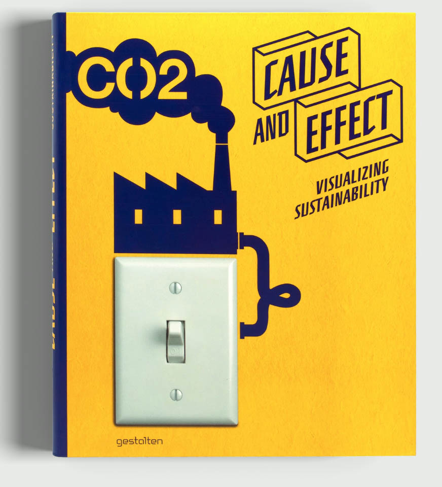
Book
It’s a few years old now, but Gestalten’s 2012 publication Cause and Effect: Visualising Sustainability contains a great range of data vis, infographics and more on the topic of climate change:
The fact that these graphics are often used in campaigns, posters, and advertisements points to a similar thing – as well as explaining complex issues, data vis can have an iconic value. It has the ability, like a logo or famous piece of art, to not only represent something, but stand for something.
If you’re interested in these data visualisations, you’d probably love the piece we just made for Junkee Media . We worked with @junkee to bring the voices of Australian youths to life, how they feel, what the future holds, and what they can do.