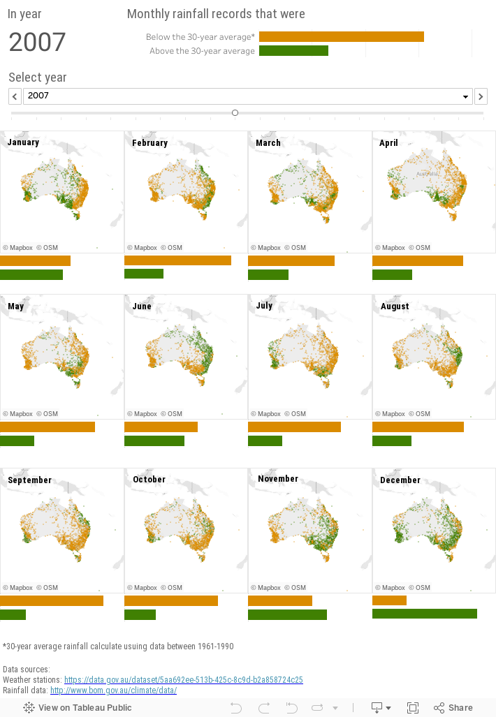
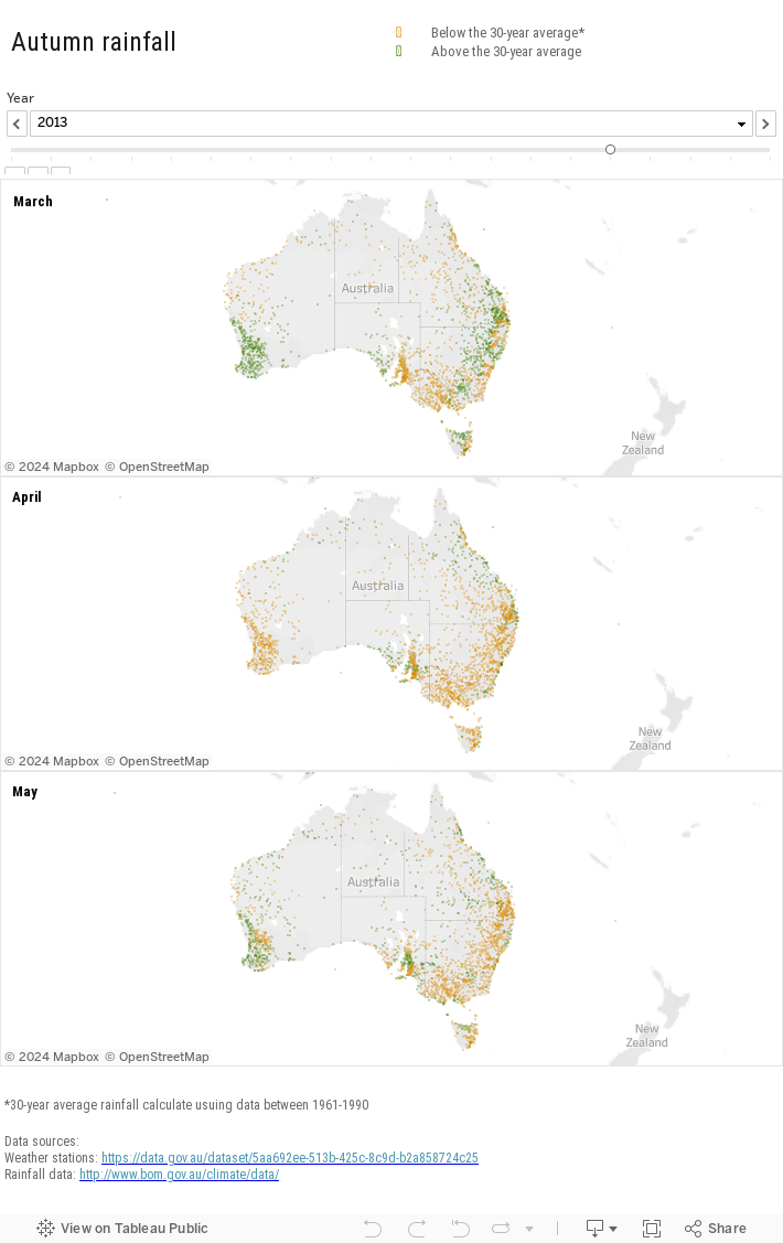
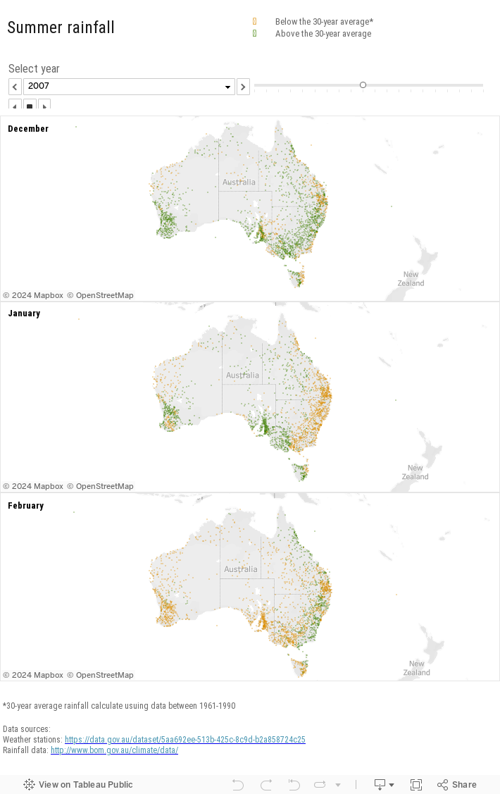
The ongoing drought in eastern Australia has been devastating to the farmers. I wanted to know if the shortage of rain reflects the general trend of the past decades. Monthly rainfall data from all BOM weather stations across Australia are compared to the 30-year average at the same location. The result of the comparison is on a series of maps, the orange colour represents instances where the rainfall was below average, whereas green represents above average rainfall.
The visualisation says it loud and clear, except for the occasional wet years like 2010 and 2016, there are more locations that have become drier over time than those received equal or increased rainfall. A worrying future for all of us.
Tableau Desktop was used to created these rainfall maps.
Play the video to see rainfall patterns between 2007-2017
Explore the full dataset
Seasonal patterns
Small Multiples has a genuine interest in developing data-driven solutions for helping farmers to meet the challenges of a changing climate. Small Multiples team has been working with CSIRO on the WaterWise app which is part of the initiative that focuses on providing Australian irrigators with digital strategies to confidently apply irrigation water at the right time to optimise yield, quality and water use for high-value crops.
Want more? Check out the other interactive maps by Small Multiples: