‘Quantified self’ has been around for a while now. The myriad of fitness trackers that line the shelves (including the one you lost in the last load of washing) is a testament to the excitement…
Posts Published by Jack Zhao
Will you outlive your representatives in parliament?
Data sources ABS Life Tables Senators and Members by Date of Birth
The average face of Labor, Liberal and National party in the Australian Parliament
F1 & M2: NATIONALF2 & M1: LIBERALF3 & M3: LABOR Methodology Photos from Australian Parliament House Image generated using Face Morpher
Inspirations #8
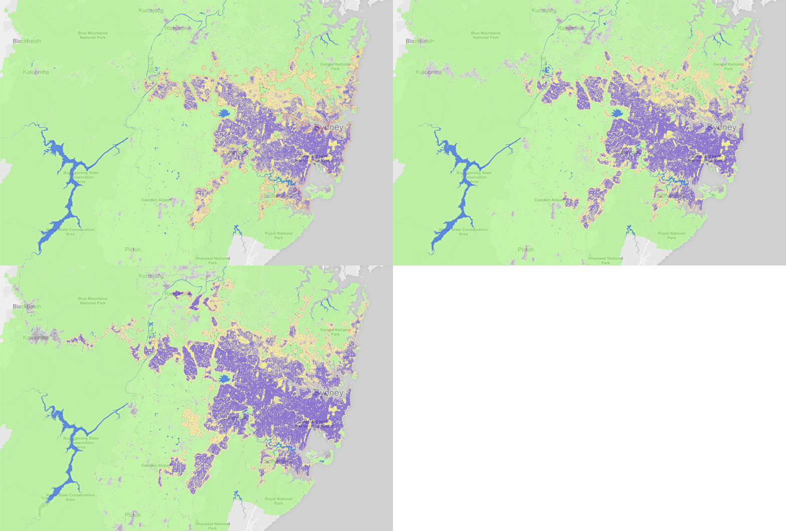
Atlas of Urban Expansion The NYU Urban Expansion Program monitors the global urban expansion on cities of 100,000 people or more. In addition to being an excellent source of data, the website has a map…
Inspirations #6
Simulated Dendrochronology of U.S. Immigration 1790-2016 This nature-inspired visualisation shows the shift in the origins of immigration to the U.S. from Europe to Latin America and Asia. The designers at have found the perfect analogy…
Inspirations #5
#DayDohViz A silver winner of the Information is Beautiful Awards 2018, DayDohViz is a daily inspiration project from Amy Cesal that experiments with physically visualising data using Play-Doh. Topics such as breaking down personal expenses and…
How the 2018 Queensland bushfire spread
More than 100 fires burned across the state of Queensland in late November/early December 2018. The fires were caused by unprecedented alignment of climate change, heatwave conditions and catastrophic fire danger. Emergency services described it…
Inspirations #4
The Random Walker The Galton Board is a wonderful piece of physical visualisation device that demonstrates the concepts of randomness, the normal distribution, the central limit theorem, and regression to the mean. China Rules This…
Inspirations #3
Coral Cities Craig Taylor visualised transport data in a very unique way – transforming Mercer Quality of Living Rank into 30min drive-time corals. The visualisations mimic the beautiful organic forms of corals, each strand shows…
Inspirations #2
When Children Lack Nutrition This is such a powerful piece of tangible infographics. Being able to hold the measuring tape in one’s hand, the fragility of the sick child’s life is understood immediately. (via @aLucasLopez) How…


