More than 100 fires burned across the state of Queensland in late November/early December 2018.
The fires were caused by unprecedented alignment of climate change, heatwave conditions and catastrophic fire danger. Emergency services described it as extreme conditions “never seen before in Queensland” .
Even for many people living in Australia, being close to this disaster, the devastation caused by the fire is still unfathomable. Therefore I felt compelled to show the world (and myself) how much land the fires consumed, and how the fires spread throughout the cause of 10 days (27 November 2018 – 6 December 2018).
Snapshots
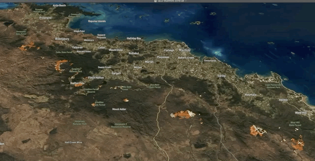
Spot colour represents the Brightness temperature I-5: I-5 Channel brightness temperature of the fire pixel measured in Kelvin. Brighter colours equal higher I-5 value.
Fires with low confidence value are excluded.
The devastating power of the fires are demonstrated by their simultaneity, the coverage of large land mass, and the speeds at which they spread outward.
Full video
Visualise the data yourself in kepler.gl
You can download the project file below (include data, filters and styling) and load it in kepler.gl.
Notes
- kepler.gl for map visualisation http://kepler.gl/
- NASA active fire data https://firms.modaps.eosdis.nasa.gov/active_fire/#firms-shapefile
Small Multiples had done a similar visualisation of some of the worst bushfires in Australian history. View the archived version of the project here.