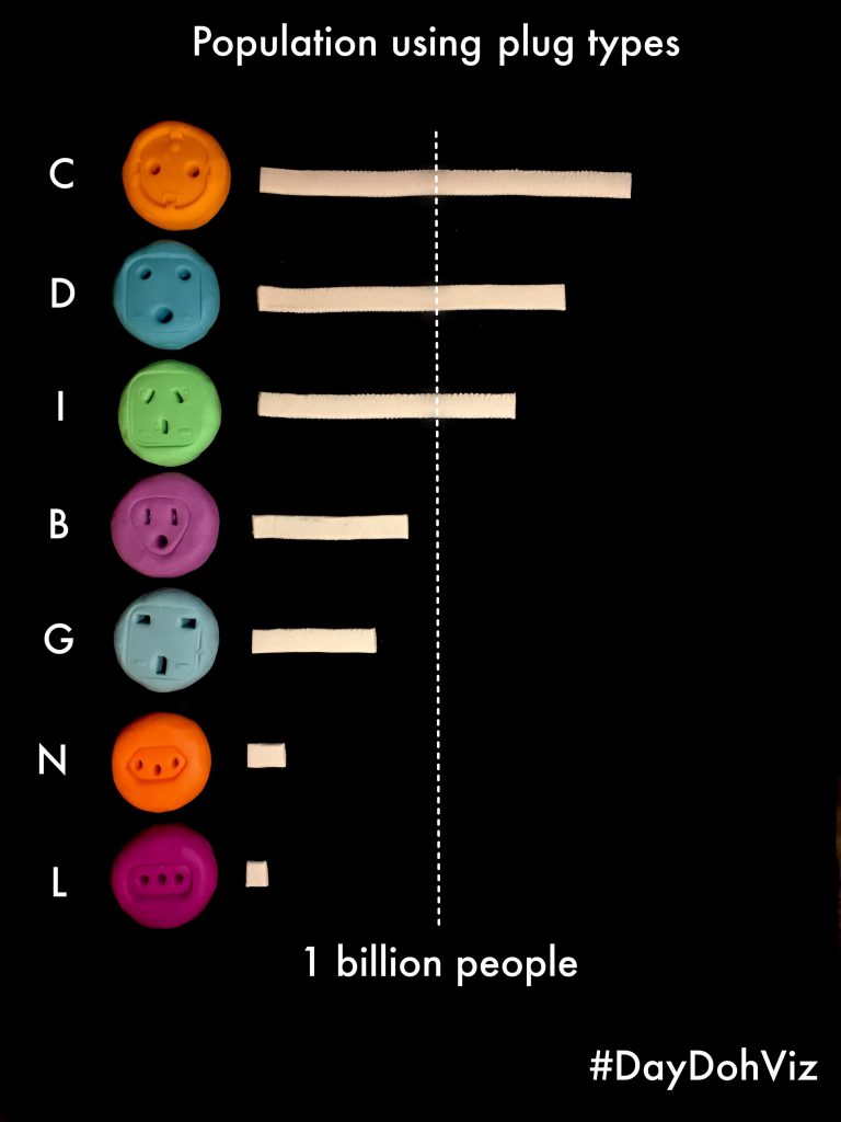
#DayDohViz
A silver winner of the Information is Beautiful Awards 2018, DayDohViz is a daily inspiration project from Amy Cesal that experiments with physically visualising data using Play-Doh. Topics such as breaking down personal expenses and Christmas turkey cook time were playfully visualised using the world’s most popular modelling clay.
Last Gasp
Europe Beyond Coal used latest official emission data and state-of-the-art atmospheric modelling to visualise the the pollution caused by 91 coal power plants currently operating in Europe. The success of this visualisation relies on its strong association to weather map, which people are familiar with, and therefore was able to demonstrate clearly where the pollution ends up and how widespread they are.
Gridlock in the sky
As the new space race is heating up, the space industry wants to launch more rockets through an already congested airspace. These launches impose disruptions to commercial flights, and this explainer from the Washington Post shows how.
Book announcement from Andy Kirk
The second edition of Andy Kirk’s “Data Visualisation: A Handbook for Data Driven Design” will be published on 29th June 2019.
(You’ll find this and other books in a list of great data vis books we’ve recently put together)