In its history, information visualisation has often stood somewhere between fact and narrative, between science and art. Medieval European maps, for example, were usually a mixture of geographical fact and theological order. The T-O map…
Browsing Category Inspirations
Inspirations #16 – Information is Beautiful shortlist 2019
The 2019 Kantar Information is Beautiful Awards Shortlist came out this week – these are some of our favourites. The Room Of Change As data visualisations go, they don’t come much more epic than this….
Inspirations #15: Impeach this
With impeachment efforts against Donald Trump gaining momentum and U.S. politics becoming ever more combative, we found three charts this week that describe the divisions in contemporary America. A client recently sent us the great…
Inspirations #13: Climate Strike
Climate change doesn’t seem to be top of the Australian government’s agenda, but students think differently. For #climatestrike day, we’ve put together a few of the most compelling visualisations that are helping make the extent…
Inspirations #12 – Visualising Connections
Eyeo talks Over the past few weeks, Eyeo have been releasing their 2019 conference videos. I especially liked this one from Nadieh Bremer, which was based around the topic of connections. She starts off with…
Inspirations #11
‘Quantified self’ has been around for a while now. The myriad of fitness trackers that line the shelves (including the one you lost in the last load of washing) is a testament to the excitement…
Inspirations #10 – Sonja Kuijpers’ ‘A view on despair’
This beautiful SVG landscape… … is a visualisation of everyone who committed suicide in the Netherlands in 2017. Created by Sonja Kuijpers of Studio Terp and published last week, the project is called ‘A view on…
The big list of data visualisation books
There’s a lot of books out there on data visualisation – from collections of luscious graphics, to practical how-to guides and specialist texts. Here’s what’s on our bookshelf, and what we’d like to add.
‘The underlying structure of the world’ – the data art of Gregory J. Matthews
Gregory J. Matthews is assistant professor of statistics at Loyola University in Chicago. Alongside data visualisations, he also makes data inspired art.
Inspirations #8
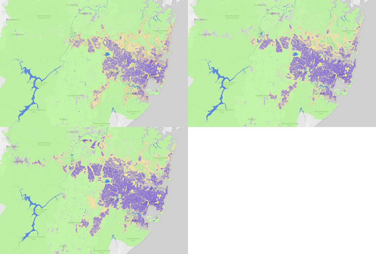
Atlas of Urban Expansion The NYU Urban Expansion Program monitors the global urban expansion on cities of 100,000 people or more. In addition to being an excellent source of data, the website has a map…


