What happens when you give a film reviewer access to algorithms that see things the human eye cannot? Film critic Luke Buckmaster uses computer vision algorithm to find new ways to explore popular movies such as Mad Max, Star Wars, Inception and Spirited Away.
Many words have been written over the years investigating use of colour in film, from its psychological implications to its narrative potential and ability to set moods. These studies almost always begin by ripping out one of the key modalities of movies: the progression of time. They involve examining isolated images or edited clips from a much larger experience, conveying little or no sense of how colours change and oscillate over the course of a running time.
What if we could start our analysis with both colours and time? What formations would we see, and what would they tell us about the craft and essence of the movie? This is what most intrigued me about playing around with technology produced by Small Multiples, an Australian data visualisation company that built a program that creates colour timelines for an entire film.
The technology led me to contemplate another question. Will the critic of the future be armed not with a notepad, but with algorithmic processes that help them see what human eyes cannot? Is this where cultural criticism is heading? Should I get ahead of the curve, and change my last name to Mnemonic, or my first name to Robo?
The program works by taking regular snapshots (about every three seconds) from throughout a movie. It then clusters the colours in those images into 32 groups and lays them out on a timeline, creating a representation of colour progression that can be comprehensible at a single glance.
So, what do these colours mean—and what can they tell us about the essence of a film and its story? I explore four case studies below, involving the Mad Max franchise, Inception, Star Wars and three Studio Ghibli films.
Case study one: the Mad Max series
George Miller’s Mad Max movies rank among the most acclaimed action films of all time, and retain a gut-busting intensity no matter how often you watch them. The protagonist is the titular leather-clad Road Warrior (played by Mel Gibson in the first three installments and Tom Hardy in the fourth) and the setting, a dystopian future world increasingly ravaged by the effects of climate change, nuclear fallout and economic ruin.
The timeline of the Mad Max movies (which I have written a book about) follow a clear linear trajectory, delving further into the future to show civilisation as we know it crumbling. This hell-in-a-handbasket journey can be charted just through the colour timelines. Let’s start with the original and work forward.
Mad Max
Arriving like a bat out of hell in 1979, the original is an antihero origins story that culminates in Max losing his wife and young child at the hands of a gang of violent marauders. It is based only slightly into the future, at a time that Miller has described as ‘next Wednesday’—when humankind’s worst fears are beginning to materialise.
Shot in and around Melbourne on a small budget, the film’s futuristic-ish look is mostly derived from its wardrobe, vehicles and carefully selected settings. There are lots of shots of roads (which are grey-ish), shrubs and parched land (earthy and brown-ish) and the sky (a washed-out blue). The opening minutes of the film look like this on the timeline.
And on a shot by shot basis, like this.

The palette deviates over the duration of the movie, but remains dominated by these kinds of earthy and washed-out tones. They reiterate the idea that this world, while different, is not too dissimilar to our own, nor too far away. In science fiction this is often called ‘the not too distant future’.
Mad Max 2: The Road Warrior
In the first Mad Max sequel (which arrived in 1981) the collapse of civilisation and the rise of anarchy has been accelerated by a world war, which saw cities burnt to the ground and roads turned into a “white-lined nightmare.” This information is conveyed via a voice-over accompanying footage presented in the style of a black-and-white newsreel. This prologue causes an aberration in the film’s colour palette, looking like this:
But when the story proper begins, involving Max being thrust into the middle of a war between rival gangs, we see a similar colour scheme as the opening of the first film—with lots of blues and browns, presenting an overall quite sedate aesthetic.
As the story progresses the film takes on a noticeably more yellow and rusty look, depicting a world with a harsher environment: more dirt, more dust, more desert. For comparative purposes, here are the timelines for the first 40 minutes of Mad Max 1 and 2, with the original on top and sequel below.

Mad Mad: Beyond Thunderdome
Based further again into the future, in Beyond Thunderdome clean water is scarce and the scraps of civilization are being reformed into new communities such as Bartertown—a filthy, woebegone place led by a tyrannical ruler named Aunty Entity (Tina Turner). The opening moments, in which Max treks across the desert, throw us into a setting much hotter and more intense looking than those captured in the previous two introductions. The palette looks like this.
And on a shot by shot level, like this:
Beyond Thunderdome’s palette becomes lusher as the narrative continues and Max visits a range of settings, including a hidden community of youth living in an oasis. But when it comes time for the climactic chase scene, in which the villains pursue Max across the desert, Miller and co-director George Ogilvie return to those really hot, intense colours we saw in the opening moments. Here’s how 10 minutes of that final chase looks like.
Mad Max: Fury Road
While a very hot and intense look visually defines the beginning and the end of Beyond Thunderdone, it defines almost the entirety of Fury Road, which arrived in 2015 and won more Oscars than any Australian film in history (six in total). Based substantially further into the future, with Tom Hardy replacing Mel Gibson as Max, the world has become a sun-scorched desert wasteland. This is strikingly reflected in its palette, as you can see from the first 40 minutes.

You can see in the timeline above a section interrupted by stretches of moody midnight blue. This occurs when the sun goes down and looks like this on the timeline.
And like this on a shot-by-shot level.

It’s blue and dark but it’s also bright in a very KABLAMO! kind of way. Because what’s a Mad Max movie without explosions?
Case study two: Star Wars lightsaber duels
If I asked you to name some colours from Star Wars, it’s quite possible that red, blue and green would enter your mind first. These are the most common colours of the lightsabers, which, conceived by George Lucas in the 70s, brought a jazzed up new twist on old fashioned sword fighting spectacle.
Lightsabers double as a reminder of which characters are good and which are bad: blue and green for the noble (i.e. Luke, Rey and Obi-Wan) and red for the wicked (i.e. Kylo, Darth Vader and Darth Maul). The best lightsaber duels aren’t about combat per se, but the relationship between the characters—given Star Wars, underneath all that bling and blam, is a soap opera. With that in mind let’s take a look at two iconic lightsaber scenes: one from the original trilogy and the other the most recent.
Luke versus Darth in The Empire Strikes Back
Ah, the old “I am your father!” sequence. A legendary moment not for the clanging of bright shiny things but the revelation that Luke Skywalker’s old man is the hideous, machine-enhanced villain who really likes wearing black. The pair’s duel in Cloud City is a hugely iconic scene in science fiction cinema. The beginning of the duel (from 1980’s The Empire Strikes Back) looks like this.
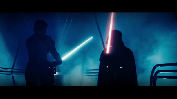
If we zoom out and look at the scene’s colour palette, it looks like this.
Skywalker’s weapon is difficult to spot because the blue of the lightsaber is similar to the misty blue light surrounding the pair and drifting through the room. Blue is a colour often associated with calmness and serenity, but can also be used to project powerful feelings of sadness and yearning—one famous example being Picasso’s blue period.
By saturating the frame with shades of blue, director Irvin Kershner offsets the violent drama of the lightsaber duel with a softness that allows some intimacy between the two characters. If the scene had been bathed in a stronger and more standoffish colour, such as red, a stronger association would have been made with hostility and danger.
Rey and Kylo versus the Praetorian guard
Hostility and danger—generated from the colour red—in fact dominate another classic lightsaber scene: the fight between Rey and Kylo and the Praetorian Guards in 2017’s The Last Jedi. This shows an inversion of the “I am your father” palette. Instead of Luke’s blue lightsaber melting into the colour of the surrounding elements, it is Kylo’s red lightsaber that becomes part of the dominant scheme.
The Praetorian guard combat scene looks like this on the timeline.
And like this on a shot-by-shot level.

Use of grey imbue the setting with a cold, cement-like steeliness. The red meanwhile reminds us—like a stop sign or a traffic light—that there is an inherent danger. That danger is less about the Praetorian guard than Kylo’s proposition at the end of the scene to Rey, when he asks her to join him so “we can rule together and bring a new order to the galaxy.”
This is similar to Vader’s proposition to Luke (“join me, and together we can rule the galaxy as father and son”). But Vader was calm and collected; Ren is impetuous and hot-tempered.
Case study three: dream layers in Inception
Christopher Nolan’s mind-bending sci-fi thriller—about thieves who steal information by burrowing into people’s subconsciousness—is most memorable for its literalization of Edgar Allan Poe’s famous hypothesis about reality: that it is “a dream within a dream.” We see that literalized in the film’s ending, when Dom (Leonardo DiCaprio), Ariadne (Ellen Page) and the rest of their team go deep into the mind of a wealthy businessman, Robert (Cillian Murphy) by launching a dream within a dream within a dream (that’s one extra dream: take that, Poe!).
The question I most wanted answered from the palette timeline was: can we observe those different dream layers purely through use of colour? The short answer is: sort of. We can certainly observe two layers, but there are four (depending on where you draw the line). Here is what a big chunk of the last act looks like.
You can clearly see changes occurring in distinct, blocked-off bursts of colour (warm goldenish hues and streaks of white-ish grey) cutting into each other.
The white-ish grey looks cold and standoffish for a good reason, belonging to scenes that take place in and around an icy fortress in a snow-covered setting. This setting resembles similarly winty far-flung locations such as Superman’s ‘Fortress of Solitude’ and the ice palace in the 2002 James Bond film Die Another Day.
But here the location signifies something far away in a psychological rather than geographic sense. Those familiar with Inception will recall that this location is a fortified mountain hospital situated deep in the subconscious mind of the aforementioned businessman.
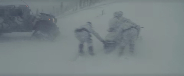
The orangey-brown injections of colour belong to a separate layer in the film’s reality: the tier above in the dream structure. These scenes are set in a hotel where there is no gravity, as you can see in the image below, due to a flow-on effect that occurred from an event that happened in the layer above that.
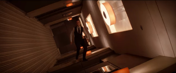
When things don’t go to plan in the snow-covered fortress, Dom and Ariadne launch a daring mission to delve even further into the dreamscape, to a place called ‘limbo’—where the (sort of) ghost of Dom’s wife (sort of) resides. It’s complicated. In this location Nolan uses a colour scheme that is mostly consistent with the snow-covered dreamscape: lots of concrete-looking greys and whites, as you can see in these shots, which makes it difficult to distinguish on the timeline.

As the characters spend more time in limbo and venture further into the city, the colour tones become warmer, more human, more emotional. And for good reason: they capture moments shared between Dom and his estranged wife.
Case study four: comparing Grave of the Fireflies, My Neighbour Totoro and Spirited Away
So far we’ve examined how colour communicates narrative trajectory over the course of a franchise (the Mad Max movies), how it’s used in lightsaber duels in Star Wars and the extent to which it distinguishes layers of the dreamscape in Inception. Now let’s take a step back and look at how three different films produced by the same production company—the legendary Studio Ghibli—use colours to express their key themes.
Grave of the Fireflies
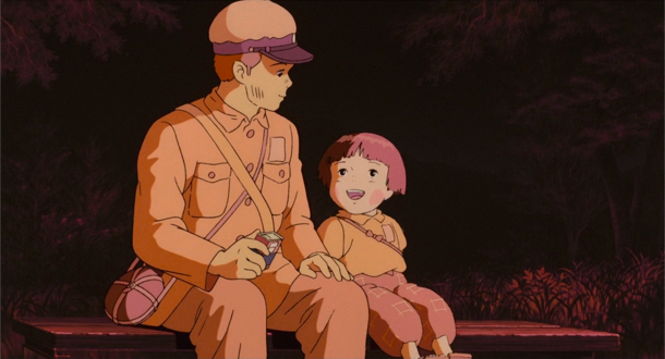
As you can see from the timeline above, the palette of Grave of the Fireflies is somber and muted. It’s the bleakest palette of any Studio Ghibli film for an obvious reason: it’s the company’s bleakest film, full stop. Released in 1988 and directed by Isao Takahata, it is a devastating drama about two siblings—a teenage boy and his very young sister—struggling (and ultimately failing) to survive in Japan during the final months of World War II.
The opening moments are coated with a striking blood red aesthetic that sets the tone going forward. There are fleeting moments of happiness, mostly involving the warmth and unshakable bond shared between the two siblings. But this is a tragic and desperately sad story. Not all the colours are dark and somber, but the palette is very far from bright, bubbly, effervescent.
My Neighbour Totoro
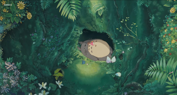
One of the most beloved films of the great Hayao Miyazaki, 1988’s My Neighbour Totoro joyously captures the imagination and optimism of youth. In other words: a very different experience to Grave of the Fireflies, with a colour palette to prove it. You can see in the timeline above plenty of green—a colour associated with renewal, rebirth, balance and harmony.
The film is based in and around an enchanted forest where two young girls meet the titular creature: a huge, cuddly, cat and bear-like spirit animal named O Totoro. In a different production, the colour and look of the forest might have communicated that there is something to be afraid of here. Instead Miyazaki infers the opposite: that this is a welcoming space, full of comforting elements and natural wonder.
Spirited Away
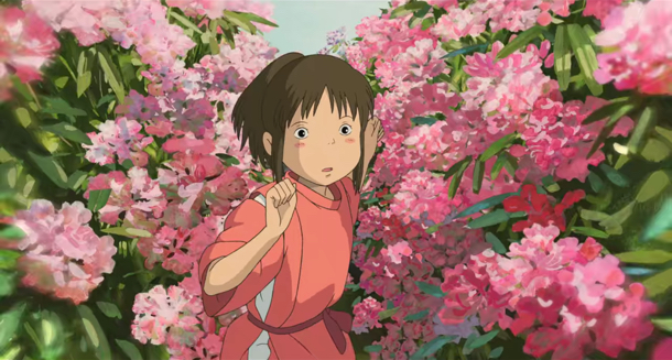
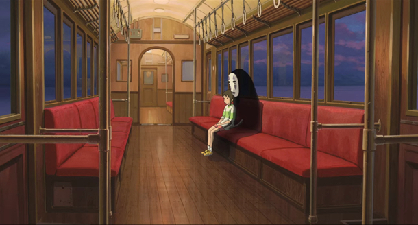
The colour palette of another great Miyazaki film, 2001’s Spirited Away, is bright and eclectic—much more varied than Grave of the Fireflies and My Neighbour Totoro. This is befitting of a film that takes the viewer by surprise, regularly switching settings and even realities. It follows a young girl separated from her parents—after they transform into pigs—who navigates a wild universe, full of bizarre creatures that make their newly piggy parents look normal by comparison.
The eccentric storyline is reflected in its colour palette, which is wild and varied—reiterating the point that we never quite know what’s going to happen next. Before you know it, pow!. The protagonist encounters a spider-like character running a boiler room, and a mask-wearing spirit that consumes individuals in order to take on their physical traits. It’s very weird, and very very good.
Over the years I have returned many times to Martin Scorsese’s simple yet profound description of cinema as being “a matter of what’s in the frame and what’s out”. Sometimes meaningful use of colour is a lucky accident; often it is the result of careful selections that impart palettes with particular emotional meanings and associations. The ability to distil movement of time into static images using Small Multiples’ technology was a very unusual and interesting experience.
When I asked Jack Zhao, the man who created the program, whether he wanted to add any of his thoughts to this article, he explained the technology as follows: “Computer algorithms extend our capabilities to see beyond our limited mental frames. They can help us to examine the stories and the creator’s intentions from a thousand miles up, almost a god-like vantage point”.
When Jack explained to me that the technology uses a clustering algorithm called K-means, which has “non-deterministic properties”, my head began to hurt. I had no idea what he was talking about, or whether the dialect he was communicating in was human. But he certainly makes an interesting point about the role algorithms could play in cultural analysis going forward. It’s fascinating to comprehend: a new kind of analysis for a new era, fusing together the computer and the critic.


